Introduction
After a series of trial and error approaches with sequential evaluation, the final logo design for the Zara brand was completed successfully. This section expounds of the final logo layout, imagery, color, type, and other factors that give the logo a redefined appeal.
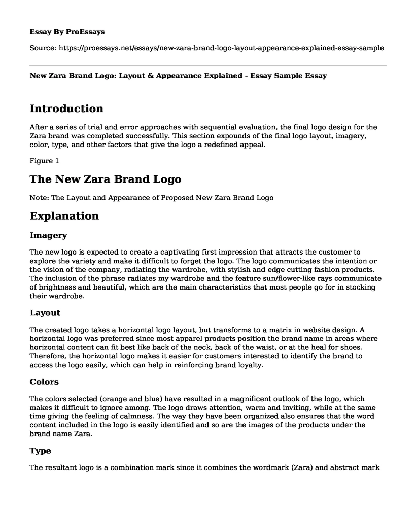
Figure 1
The New Zara Brand Logo
Note: The Layout and Appearance of Proposed New Zara Brand Logo
Explanation
Imagery
The new logo is expected to create a captivating first impression that attracts the customer to explore the variety and make it difficult to forget the logo. The logo communicates the intention or the vision of the company, radiating the wardrobe, with stylish and edge cutting fashion products. The inclusion of the phrase radiates my wardrobe and the feature sun/flower-like rays communicate of brightness and beautiful, which are the main characteristics that most people go for in stocking their wardrobe.
Layout
The created logo takes a horizontal logo layout, but transforms to a matrix in website design. A horizontal logo was preferred since most apparel products position the brand name in areas where horizontal content can fit best like back of the neck, back of the waist, or at the heal for shoes. Therefore, the horizontal logo makes it easier for customers interested to identify the brand to access the logo easily, which can help in reinforcing brand loyalty.
Colors
The colors selected (orange and blue) have resulted in a magnificent outlook of the logo, which makes it difficult to ignore among. The logo draws attention, warm and inviting, while at the same time giving the feeling of calmness. The way they have been organized also ensures that the word content included in the logo is easily identified and so are the images of the products under the brand name Zara.
Type
The resultant logo is a combination mark since it combines the wordmark (Zara) and abstract mark (radiant picture). This type was preferred due to its versatility, uniqueness, and one that communicates effectively on the nature of the brand.
Other Compositional Factors
Another relevant inclusion in the logo is the bold, text shadowed, and large font size Zara name. These attributes were intentionally selected to ensure that the name of the brand is easily identifiable. The slogan radiates my wardrobe makes the customer own the pride of the Zara brand, hence, engendering a feeling of brand ownership crucial in reinforcing brand loyalty.
Rationale
The renewed design owns the origin of the word Zara, which means radiant or flower. The inclusion of a radiant imagery adds value is aimed and reinforcing the brand image and identity (Girard et al., 2013). Also, the change of brand colors from black and white to orange and blue further boosts the visual impression of the brand transforming it from archaic brand to a live modern brand (Luffarelli et al., 2019).
References
Luffarelli, J., Mukesh, M., & Mahmood, A. (2019). Let the Logo Do the Talking: The Influence of Logo Descriptiveness on Brand Equity. Journal of Marketing Research, 56(5), 862-878. https://doi.org/10.1177/0022243719845000
Girard,T., Anitsal, M.M. & Anitsal, I. (2013). The role of logos in building brand awareness and performance: implications for entrepreneurs. Entrepreneurial Executive, 18(1); 7 - 16.
Cite this page
New Zara Brand Logo: Layout & Appearance Explained - Essay Sample. (2023, Jun 10). Retrieved from https://proessays.net/essays/new-zara-brand-logo-layout-appearance-explained-essay-sample
If you are the original author of this essay and no longer wish to have it published on the ProEssays website, please click below to request its removal:
- Relevance for Semiotics for Contemporary Design Essay
- Research Paper on Turnaround Strategy for Harley-Davidson Company
- Impact of Marketing on the Organisation's Objectives and Its Position Within a Sector or Market
- Integrated Change - Essay Sample
- Paper Example on Sierra Club: A Non-Profit Environmental Organization in America
- Organization's Progress Boosted Through Effective Skills Training - Essay Sample
- Walmart Labor Dispute: Conflict Management for Positive Change - Research Paper


